Paper Format
Consistency in the order, structure, and format of a paper allows readers to focus on a paper’s content rather than its presentation.
To format a paper in APA Style, writers can typically use the default settings and automatic formatting tools of their word-processing program or make only minor adjustments.
The guidelines for paper format apply to both student assignments and manuscripts being submitted for publication to a journal. If you are using APA Style to create another kind of work (e.g., a website, conference poster, or PowerPoint presentation), you may need to format your work differently in order to optimize its presentation, for example, by using different line spacing and font sizes. Follow the guidelines of your institution or publisher to adapt APA Style formatting guidelines as needed.
Paper format is covered in Chapter 2 of APA Publication Manual, Seventh Edition
**All information taken from: APA Style Website
Order of pages is covered in Section 2.17 of the APA Publication Manual, Seventh Edition
All papers, including student papers, generally include a title page, text, and references. They may include additional elements such as tables and figures depending on the assignment. Student papers generally do not include an abstract unless requested.
Arrange the pages of an APA Style paper in the following order:
- title page
- abstract
- text
- references
- footnotes
- tables
- figures
- appendices
In general, start each section on a new page. However, the order of pages is flexible in the following cases:
- tables and figures: Embed tables and figures within the text after they are first mentioned (or “called out”), or place each table and then each figure on separate pages after the references. If an embedded table or figure appears on the same page as text, place it at either the top or the bottom of the page, and insert a blank double-spaced line to separate the table or figure from the adjacent text.
- footnotes: Use the footnotes function of your word-processing program to insert a footnote at the bottom of the page of text on which the footnote appears, or list footnotes together on a separate page after the references.;
Papers such as dissertations and theses may require additional elements not listed here. Follow the institutional or departmental guidelines of your university to order the pages of a dissertation or thesis.
A title page is required for all APA Style papers. There are both student and professional versions of the title page. Students should use the student version of the title page unless their instructor or institution has requested they use the professional version. APA provides a student title page guide (PDF, 199KB) to assist students in creating their title pages.
Student Title Page
The student title page includes the paper title, author names (the byline), author affiliation, course number and name for which the paper is being submitted, instructor name, assignment due date, and page number, as shown in the following example.
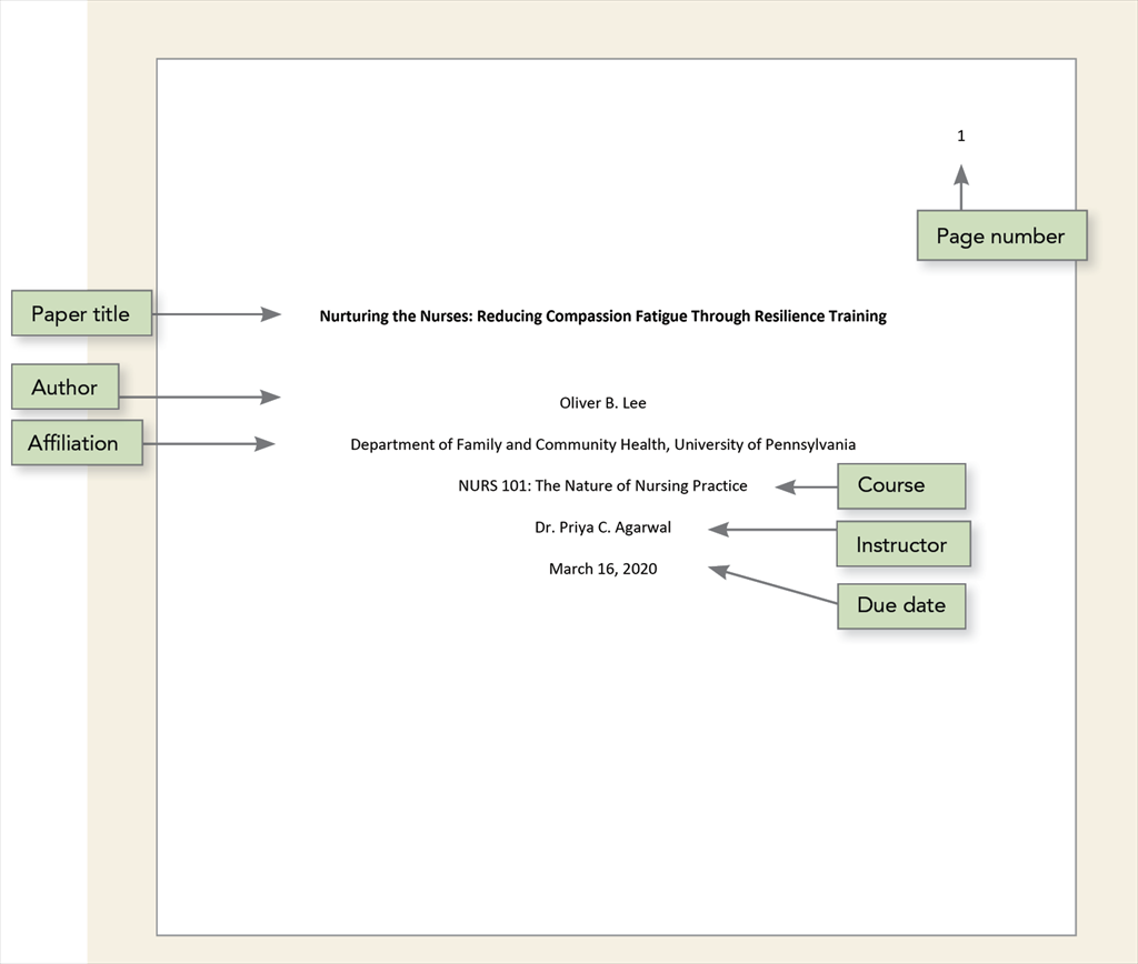
Student papers do not include a running head unless requested by the instructor or institution.
Follow the guidelines described next to format each element of the student title page.
|
Student title page element |
Format |
Example |
|---|---|---|
|
Paper title |
Place the title three to four lines down from the top of the title page. Center it and type it in bold font. Capitalize major words of the title. Place the main title and any subtitle on separate double-spaced lines if desired. There is no maximum length for titles; however, keep titles focused and include key terms. |
Impact of Gender on the Evaluation of Humor in Romantic Relationships |
|
Author names |
Place one double-spaced blank line between the paper title and the author names. Center author names on their own line. If there are two authors, use the word “and” between authors; if there are three or more authors, place a comma between author names and use the word “and” before the final author name. |
Cecily J. Sinclair and Adam Gonzaga |
|
Author affiliation |
For a student paper, the affiliation is the institution where the student attends school. Include both the name of any department and the name of the college, university, or other institution, separated by a comma. Center the affiliation on the next double-spaced line after the author name(s). |
Department of Psychology, University of Georgia |
|
Course number and name |
Provide the course number as shown on instructional materials, followed by a colon and the course name. Center the course number and name on the next double-spaced line after the author affiliation. |
PSY 201: Introduction to Psychology |
|
Instructor name |
Provide the name of the instructor for the course using the format shown on instructional materials. Center the instructor name on the next double-spaced line after the course number and name. |
Dr. Rowan J. Estes |
|
Assignment due date |
Provide the due date for the assignment. Center the due date on the next double-spaced line after the instructor name. Use the date format commonly used in your country. |
October 18, 2020 |
|
Use the page number 1 on the title page. Use the automatic page-numbering function of your word processing program to insert page numbers in the top right corner of the page header. |
1 |
Professional Title Page
The professional title page includes the paper title, author names (the byline), author affiliation(s), author note, running head, and page number, as shown in the following example.
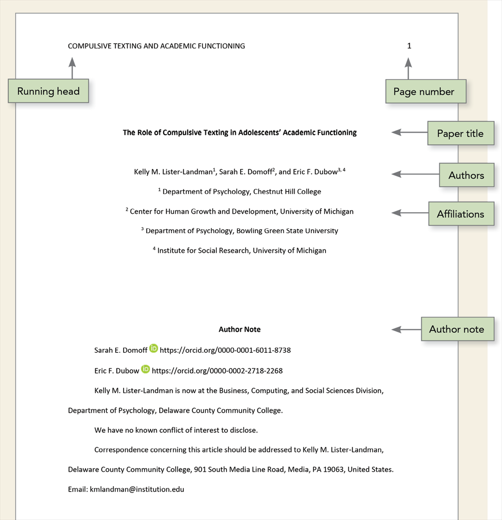
Follow the guidelines described next to format each element of the professional title page.
|
Professional title page element |
Format |
Example |
|---|---|---|
|
Paper title |
Place the title three to four lines down from the top of the title page. Center it and type it in bold font. Capitalize major words of the title. Place the main title and any subtitle on separate double-spaced lines if desired. There is no maximum length for titles; however, keep titles focused and include key terms. |
Predict and Redirect: Prediction Errors Support Children’s Word Learning |
|
Author names
|
Place one double-spaced blank line between the paper title and the author names. Center author names on their own line. If there are two authors, use the word “and” between authors; if there are three or more authors, place a comma between author names and use the word “and” before the final author name. |
Francesca Humboldt |
|
When different authors have different affiliations, use superscript numerals after author names to connect the names to the appropriate affiliation(s). If all authors have the same affiliation, superscript numerals are not used (see Section 2.3 of the Publication Manual for more on how to set up bylines and affiliations). |
Tracy Reuter1, Arielle Borovsky2, and Casey Lew-Williams1 |
|
|
Author affiliation
|
For a professional paper, the affiliation is the institution at which the research was conducted. Include both the name of any department and the name of the college, university, or other institution, separated by a comma. Center the affiliation on the next double-spaced line after the author names; when there are multiple affiliations, center each affiliation on its own line.
|
Department of Nursing, Morrigan University |
|
When different authors have different affiliations, use superscript numerals before affiliations to connect the affiliations to the appropriate author(s). Do not use superscript numerals if all authors share the same affiliations (see Section 2.3 of the Publication Manual for more). |
1 Department of Psychology, Princeton University |
|
|
Author note |
Place the author note in the bottom half of the title page. Center and bold the label “Author Note.” Align the paragraphs of the author note to the left. For further information on the contents of the author note, see Section 2.7 of the Publication Manual. |
n/a |
|
The running head appears in all-capital letters in the page header of all pages, including the title page. Align the running head to the left margin. Do not use the label “Running head:” before the running head. |
PREDICTION ERRORS SUPPORT CHILDREN’S WORD LEARNING |
|
|
Use the page number 1 on the title page. Use the automatic page-numbering function of your word processing program to insert page numbers in the top right corner of the page header. |
1 |
A variety of fonts are permitted in APA Style papers. Font options include the following:
- sans serif fonts such as 11-point Calibri, 11-point Arial, or 10-point Lucida Sans Unicode
- serif fonts such as 12-point Times New Roman, 11-point Georgia, or normal (10-point) Computer Modern (the default font for LaTeX)
We recommend these fonts because they are legible and widely available and because they include special characters such as math symbols and Greek letters. Historically, sans serif fonts have been preferred for online works and serif fonts for print works; however, modern screen resolutions can typically accommodate either type of font, and people who use assistive technologies can adjust font settings to their preferences. For more on how font relates to accessibility, visit the page on the accessibility of APA Style.
Use the same font throughout your paper, with the following exceptions:
- figures: Within figure images, use a sans serif font with a type size between 8 and 14 points.
- computer code: To present computer code, use a monospace font such as 10-point Lucida Console or 10-point Courier New.
- footnotes: When inserting footnotes with the footnotes function of your word-processing program, use the default font settings. The footnote font might be smaller than the text font (and have different line spacing), and it is not necessary to change it.
Instructors and publishers vary in how they specify length requirements. Different fonts take up different amounts of space on the page; thus, we recommend using word count rather than page count to gauge paper length if possible.
The page header appears within the top margin of every page of the paper.
- For student papers, the page header consists of the page number only.
- For professional papers, the page header consists of the page number and running head.
Page headers are covered in Section 2.18 of the APA Publication Manual, Seventh Edition
Page Numbers
Follow these guidelines to include page numbers in both student and professional APA Style papers:
- Use the page-numbering function of your word-processing program to insert page numbers.
- Insert page numbers in the top right corner. The page number should show on all pages.
- The title page carries page number 1.
Running Head
The running head is an abbreviated version of the title of your paper (or the full title if the title is already short). The running head is not required for student papers unless the instructor or institution requests it. Thus, typically only professional papers include a running head.
Follow these guidelines to include a running head in an APA Style paper:
- Type the running head in all-capital letters.
- Ensure the running head is no more than 50 characters, including spaces and punctuation.
- Avoid using abbreviations in the running head; however, the ampersand symbol (&) may be used rather than “and” if desired.
- The running head appears in the same format on every page, including the first page.
- Do not use the label “Running head:” before the running head.
- Align the running head to the left margin of the page header, across from the right-aligned page number.
View the sample papers to see how the running head and page number appear in APA Style papers.
In general, double-space all parts of an APA Style paper, including the abstract; text; block quotations; table and figure numbers, titles, and notes; and reference list (including between and within entries). Do not add extra space before or after paragraphs.
Exceptions to double line spacing are as follows:
- title page: Insert a double-spaced blank line between the title and the byline on the title page. For professional papers, also include at least one double-spaced blank line above the author note (student papers do not include author notes). Double-space the rest of the title page.
- tables: The table body (cells) may be single-spaced, one-and-a-half-spaced, or double-spaced, depending on which is the most effective layout for the information. Double-space the table number, title, and notes.
- figures: Words within the image part of a figure may be single-spaced, one-and-a-half-spaced, or double-spaced, depending on which is the most effective layout for the information. Double-space the figure number, title, and notes.
- footnotes: When inserting footnotes with the footnotes function of your word-processing program, use the default font settings (usually single-spaced and a slightly smaller font than the text).
- displayed equations: It is permissible to apply triple- or quadruple-spacing in special circumstances, such as before and after a displayed equation.
These guidelines apply to APA Style student papers and to manuscripts being submitted for publication. If you are using APA Style in another context (e.g., on a website or in a formal publication), different line spacing and other formatting specifications may be appropriate.
Use 1-in. margins on every side of the page for an APA Style paper.
However, if you are writing a dissertation or thesis, your advisor or institution may specify different margins (e.g., a 1.5-in. left margin to accommodate binding).
APA Style includes guidelines for paragraph alignment and indentation to ensure that papers are formatted in a consistent and readable manner. All writers should follow these guidelines.
Paragraph Alignment
Align the text of an APA Style paper to the left margin. Leave the right margin uneven, or “ragged.” Do not use full justification for student papers or manuscripts being submitted for publication.
Do not insert hyphens (manual breaks) in words at the end of line. However, it is acceptable if your word-processing program automatically inserts breaks in long hyperlinks (such as in a DOI or URL in a reference list entry.
Paragraph Indentation
Indent the first line of each paragraph of text 0.5 in. from the left margin. Use the tab key or the automatic paragraph-formatting function of your word-processing program to achieve the indentation (the default setting is likely already 0.5 in.). Do not use the space bar to create indentation.
Exceptions to these paragraph-formatting requirements are as follows:
- title page: For professional papers, the title (in bold), byline, and affiliations should be centered on the title page. For student papers, the title (in bold), byline, affiliations, course number and name, instructor, and assignment due date should be centered on the title page.
- section labels: Section labels (e.g., “Abstract,” “References”) should be centered (and bold).
- abstract: The first line of the abstract should be flush left (not indented).
- block quotations: Indent a whole block quotation 0.5 in. from the left margin. If the block quotation spans more than one paragraph, the first line of the second and any subsequent paragraphs of the block quotation should be indented another 0.5 in., such that those first lines are indented a total of 1 in.
- headings: Level 1 headings should be centered (and in bold), and Level 2 and 3 headings should be left-aligned (and in bold or bold italic, respectively). Level 4 and 5 headings are indented like regular paragraphs.
- tables and figures: Table and figure numbers (in bold), titles (in italics), and notes should be flush left.
- reference list: Reference list entries should have a hanging indent of 0.5 in.
- appendices: Appendix labels and titles should be centered (and bold).
Headings identify the content within sections of a paper.
Make your headings descriptive and concise. Headings that are well formatted and clearly worded aid both visual and nonvisual readers of all abilities.
Levels of Heading
There are five levels of heading in APA Style. Level 1 is the highest or main level of heading, Level 2 is a subheading of Level 1, Level 3 is a subheading of Level 2, and so on through Levels 4 and 5.
The number of headings to use in a paper depends on the length and complexity of the work.
- If only one level of heading is needed, use Level 1.
- If two levels of heading are needed, use Levels 1 and 2.
- If three levels of heading are needed, use Levels 1, 2, and 3 (and so on).
Use only the number of headings necessary to differentiate distinct sections in your paper; short student papers may not require any headings. Furthermore, avoid these common errors related to headings:
- Avoid having only one subsection heading within a section, just like in an outline.
- Do not label headings with numbers or letters.
- Double-space headings; do not switch to single spacing within headings.
- Do not add blank lines above or below headings, even if a heading falls at the end of a page.
Format of Headings
The following table demonstrates how to format headings in APA Style.
|
Level |
Format |
|---|---|
|
1 |
Centered, Bold, Title Case Heading Text begins as a new paragraph.
|
|
2 |
Flush Left, Bold, Title Case Heading Text begins as a new paragraph.
|
|
3 |
Flush Left, Bold Italic, Title Case Heading Text begins as a new paragraph.
|
|
4 |
Indented, Bold, Title Case Heading, Ending With a Period. Text begins on the same line and continues as a regular paragraph.
|
|
5 |
Indented, Bold Italic, Title Case Heading, Ending With a Period. Text begins on the same line and continues as a regular paragraph.
|
Note. In title case, most words are capitalized.
Headings in the Introduction
Because the first paragraphs of a paper are understood to be introductory, the heading “Introduction” is not needed. Do not begin a paper with an “Introduction” heading; the paper title at the top of the first page of text acts as a de facto Level 1 heading.
It is possible (but not required) to use headings within the introduction. For subsections within the introduction, use Level 2 headings for the first level of subsection, Level 3 for subsections of any Level 2 headings, and so on. After the introduction (regardless of whether it includes headings), use a Level 1 heading for the next main section of the paper (e.g., Method).
Creating Accessible Headings
Writers who use APA Style may use the automatic headings function of their word-processing program to create headings. This not only simplifies the task of formatting headings but also ensures that headings are coded appropriately in any electronic version of the paper, which aids readers who use navigation tools and assistive technologies such as screen readers.
Here are some tips on how to create headings in some common word-processing programs:
This page contains several sample papers formatted in seventh edition APA Style.
The following two sample papers were published in annotated format in the Publication Manual and are provided here for your ease of reference. The annotations draw attention to relevant content and formatting and provide users with the relevant sections of the Publication Manual (7th ed.) to consult for more information.
We also offer these sample papers in Microsoft Word (.docx) file format without the annotations.
Sample Papers in Real Life
Although published articles differ in format from manuscripts submitted for publication or student papers (e.g., different line spacing, font, margins, and column format), articles published in APA journals provide excellent demonstrations of APA Style in action.
APA journals will begin publishing papers in seventh edition APA Style in 2020. The transition to seventh edition style will occur over time and on a journal-by-journal basis until all APA journals use the new style. Professional authors should check the author submission guidelines for the journal to which they want to submit their paper to determine the appropriate style to follow.
The APA Style team worked with accessibility experts at David Berman Communications to ensure that APA Style guidelines as presented in the Publication Manual (7th ed.) are compliant with Web Content and Accessibility Guidelines (WCAG) 2.0 Level AA standards.
Accessible Typography
Here we are going to look at some myths and facts about accessible and usable typography as relevant to APA Style. The main takeaway is this: There do not have to be trade-offs—you can have great, expressive, nuanced typography that also meets or exceeds all regulatory and functional accessibility requirements. To paraphrase David Berman, when we style for the extremes and we do it well, everyone benefits.
Myth 1: Serif Fonts Are Not Accessible
It is a common misconception that serif fonts (e.g., Times New Roman) should be avoided because they are hard to read and that sans serif fonts (e.g., Calibri or Arial) are preferred. Historically, sans serif fonts have been preferred for online works and serif fonts for print works; however, modern screen resolutions can typically accommodate either type of font, and people who use assistive technologies can adjust font settings to their preferences.
Research supports the use of various fonts for different contexts. For example, there are studies that demonstrate how serif fonts are actually superior to sans serif in many long texts (Arditi & Cho, 2005; Tinker, 1963). And there are studies that support sans serif typefaces as superior for people living with certain disabilities (such as certain visual challenges and those who learn differently; Russell-Minda et al., 2007).
However, a skilled designer can create an accessible document that uses serif typefaces effectively, and if structured according to best practice standards, that same document can have its machine text presented in other ways for particular users. For example, a person living with severe dyslexia could choose to have the font swapped in real time with a typeface and spacing that works better for them—thus, there are no trade-offs for the typical user, and the typographic tone of voice that the designer intended for the message is retained.
Furthermore, typeface selection is only one part of the typographic solution for creating accessible typography. Designers must also make wise choices about other factors including size, color, justification, letter spacing, word spacing, line spacing, character thickness, screen resolution, print readiness, and other audience and media issues.
Web Content Accessibility Guidelines (WCAG) set standards for online accessibility. WCAG 2.0 Level AA does not set any rules about typeface or type size. It does not specify which typefaces are better than others. There are effective and ineffective serif fonts, just as there are effective and ineffective sans serif fonts. If everyone were to strictly follow the Canadian National Institute for the Blind (CNIB) and the American Council of the Blind (ACB) guidelines for typography, all text would be in 12-point Arial black. Fortunately, you have the flexibility to choose from a variety of font types and identify which will best suit your work.
Furthermore, depending on your organization, there may be additional standards you have to follow to be in alignment with brand guidelines. And depending upon your jurisdiction, there may be additional regulations you need to follow (e.g., the European Union’s EN 301 549 calls for compliance with WCAG 2.1 Level AA, which includes specifics regarding line and character spacing).
Thus, a variety of typeface choices are permitted in APA Style. Also check with your publisher, instructor, or institution for any requirements regarding fonts. We recommend particular fonts in the Publication Manual because they are legible and widely available and because they include special characters such as math symbols and Greek letters. Other fonts can be used with APA Style provided that they also meet these criteria. Thus, users should be able to find a typographic solution that meets their needs.
Myth 2: All Caps Are Not Accessible
Many people have heard that is never accessible to present wording as all-capital lettering; however, this is another myth. Fear not! You can in fact use all caps in an accessible way.
It is true that presenting text in all caps will slow down all readers, especially those with certain types of visual and/or cognitive impairments. However, making sure you do not break the accessibility of wording by putting it in all caps is actually all about doing something no person reading it will see. Here’s how: Always type words with appropriate capitalization (capitals for the beginning of a sentence and proper nouns, etc., lowercase for other words). Then apply a style or text effect to create the appearance of all caps. Screen-reading devices will then announce the words correctly (as opposed to, e.g., trying to treat them as an initialism or acronym and reading out each word letter by letter). Other assistive technologies or conversions will also work correctly because they have the option to override your style to remove the all-caps style or effect. This puts the power exactly where we want it—in the hands of readers.
In APA Style papers, the running head is the only part of the paper that is written in all-capital letters. The running head appears only in professional papers. If the authors’ manuscript will appear online (e.g., as a preprint in PsyArXiv), authors should use a style or text effect as described here to format the running head in all caps.
Myth 3: Smart Quotes Are Not Needed
Using inch marks and foot marks (sometimes also called “straight quotes”) instead of proper left and right quotation marks (both double and single, including apostrophes) makes it harder for assistive technologies to understand your content. Imagine a screen reader announcing “inch” or “foot” rather than announcing the beginning or ending of a quotation.
Everyone deserves proper punctuation. So, in your word-processing program, turn on the option for “smart quotes” to help ensure that you are using the proper mark.
The following examples show the visual difference between straight quotes and proper left and right quotation marks, or smart quotes.
"Straight quotes"
“Smart quotes”
Creating Accessible Headings
Headings in a document identify the topic or purpose of the content within each section. Headings help all readers become familiar with how a document’s hierarchy is structured and how the content is organized, helping them easily find the information they seek. Headings that are formatted and worded well aid both visual and nonvisual readers of all abilities. Headings must be clearly distinguishable from body text.
How can one then create and use excellent headings (and related body text) for all users, including those using assistive technologies? Read on.
Purpose of Headings
The functional purpose of headings is to identify the topic of the content within each section. Treat your headings as if they are “landmarks” within the text, guiding readers to their desired destination. Headings allow readers searching for particular information to find it easily; readers looking to understand the scope of a work are able to do so at a glance.
Also, it is impossible to talk about presenting a truly great heading structure without crossing over into the wording within the headings. Headings should never contain content that is not within the text in the section described by the heading. In other words, if your heading is “How Many Designers Does It Take to Screw in a Lightbulb?” the text in that section must discuss designers and lightbulbs. In academic research papers, standard headings are often used, such as Method, Results, and Discussion. Standard headings allow readers to understand the structure and content of the research being reported. It is best practice to keep headings to 60 characters or less, and 80 at most. This is especially helpful to nonvisual users who could, for example, be using a dynamic Braille display that only presents 80 characters at a time.
When appropriate, headings can, accessibly, include intriguing wording intended to capture readers’ attention, as long as there is also a part of the heading that reveals what is actually present. Just like a book title can include both an intriguing phrase as well as an explanatory phrase (e.g., “Frustration Exemplified: How To Give a Cat a Pill”), you could do the same in a heading. However, context is important: For a “do it yourself” book, this might engage readers and enhance their reading pleasure. For a medical textbook, this might be distracting and even frustrating for readers trying to look up specific information.
In longer works (e.g., dissertations and theses, books), headings appear in a table of contents. The purpose of the table of contents is to give readers an overview of the entire contents of the text as well as to make them familiar with how the content is organized in sections and subsections. Especially for reference works, this is a vital part of the reader interaction. The table of contents, in essence, is a collection of the headings within the text. Readers use visual style and content to understand the importance of the heading (the hierarchy) and the topic or purpose of the content in the section labeled by the heading. Thus, if you have excellent headings (both in content and in visual style), you will generate an excellent table of contents. For electronic documents, excellent headings will help you generate an excellent navigational structure as well.
The Publication Manual does not set standards for tables of contents because journal articles and student papers do not contain tables of contents. For works that include a table of contents, such as dissertations and theses, APA recommends that you use the automatic table of contents function of your word-processing program to create the table of contents. Any of the automatic formats are acceptable. Typically the three highest levels of heading within each chapter or section are included in the table of contents; however, this can vary depending on the length and complexity of the work.
Are You Required to Use Heading Styles in Your Work?
Writers should use heading styles to format and electronically tag headings to help their audience of readers navigate and understand their work. Heading styles also help students create consistently formatted headings.
However, in some cases, using heading styles (vs. manually formatting body text to look like a heading) is optional. The most common case in which it is optional to use heading styles to format text is when authors are submitting a manuscript for publication. Regardless of whether the authors use heading styles in their manuscript, the typesetter will strip the work of all heading styles and implement the headings styles of the publisher. Thus, it is not required for authors to use headings styles in draft manuscripts, but they can if desired. For example, during review, heading styles may help editors and reviewers navigate the work, especially a longer work.
Likewise, students are not required to use heading styles to format their headings, but they can if desired. For example, if students submit a course assignment on paper, it will not matter whether they used heading styles or manual formatting to create the look of headings. However, if students submit an assignment electronically, it may be helpful to use heading styles to facilitate the instructor’s navigation of their work.
If writers are self-publishing their work online, it is helpful to use heading styles to assist readers in navigating the work. For further advice on how to use heading styles, particularly when publishing your work online, read more about accessible typography and style at David Berman Communications.
Inclusion of URLs in Reference Lists
WCAG 2.0 Level AA guidelines recommend that URLs in online works have descriptive text. For example, in the preceding sentence, the words “URLs in online works have descriptive text” are linked to the page at this example URL..
However, APA Style references include links with anchor text that is simply the destination DOI or URL (vs. anchor text that is natural, descriptive language)—does this mean that APA Style references are not accessible?
APA Style References Meet Accessibility Standards
To answer this question, the APA Style team consulted with accessibility experts at David Berman Communications to develop our strategy for seventh edition references. Although we considered creating references that included descriptive text links (e.g., linking the title of the work), we settled on the current approach for a few reasons:
- A reference list is not meant to be read from start to finish but rather consulted as needed if readers want more information on works cited in the text. Thus any reader—including a person using a screen reader—would not be expected to follow every link in a reference list. Even if the links in the reference list were beneath descriptive text, the list of links in the reference list would not be particularly helpful on its own because those links need the context of the in-text citation for readers to understand why the links are relevant.
- APA Style governs how manuscripts meant for publication and student papers are prepared. These papers might be read either in print or online. Thus, it is helpful to preserve the actual link address to account for the case in which the work is printed. This approach also produces one set of general guidelines rather than multiple sets, which simplifies writers’ task of understanding and implementing the APA Style reference system.
Because reference lists are not meant to be read from start to finish and because works in APA Style may be published either online or in print, our guidelines recommend that links show the DOI or URL of the work rather than be beneath descriptive text. Links in the text (which are relatively rare—they are only used for general mentions of websites) are treated in the same way; the URL should immediately follow the name of the page being linked to. To reduce the length of links, shortDOIs and shortened URLs are also acceptable.
Using Descriptive Links in APA Style
Although the Publication Manual addresses how to use APA Style for journal publication and student papers, APA Style is used in other contexts as well. Users who develop online-only resources should adapt APA Style to fit their needs. This adaption includes, but is not limited to, the use of descriptive links throughout texts and reference lists.
For example, on this very webpage and throughout the APA Style website, all links appear beneath descriptive text. Other users of APA Style in online contexts should follow this practice as well.
Likewise, in references, people creating online works in APA Style can put the DOI or URL beneath descriptive text. Some reference databases put DOIs or URLs beneath buttons labeled “Article.” Another approach is to link the title of the work to the work’s URL or DOI, as in the following examples.
American Psychological Association. (2019). Talking with your children about stress.
Warne, R. T., Astle, M. C., & Hill, J. C. (2018). What do undergraduates learn about human intelligence? An analysis of introductory psychology textbooks. Archives of Scientific Psychology, 6(1), 32–50.
Accessible Use of Color in Figures
The use of color also presents accessibility concerns. In APA Style, color is most commonly used within figures. It is important that color figures have adequate color contrast to allow users living with color-vision deficiencies (also called “color blindness”) to understand the material. For a thorough description of the accessible use of color, please visit the page on the accessible use of color in figures.