Need help with data visualization?

Choosing a Data Visualization
Data visualizations include simple graphs like bar and pie charts, scatter plots, and line graphs, but they can also be more complicated, like network visualizations or 3D models. This guide will walk you through the process of deciding if a data visualization project is a good choice for your research.
We often think of data as numeric, but it can also be text, images, qualitative, time-based, spatial, and more. The best type of visualization for your research will depend on the data you're using and what you want to show on your visualization.
The most important thing to remember about data visualization is that they are meant to make data easier to understand. Do not inadvertently make the data harder to understand with a confusing or overly complicated visual. The more you create data visualizations, the better you'll become at clarifying the dataset with the visual. See Making an Effective Data Visualization for examples.
When choosing your visualization, consider the following:
- What kind of data do you have?
- Summary statistics? Time-based? Categorical? GIS or spatial?
- What format is it in?
- Is it tabular (spreadsheet) data? Free text? Another format like SQL or R?
- What do you want to show?
- Changes over time? Comparisons between a few separate categories?
A great place to research data visualizations and find ones suitable to your goals is the Data Visualization Catalogue. You can search by function to see those appropriate to your data type or general visualization method.
What makes an effective data visualization?
Data visualizations are meant to make a dataset easier to understand. Unfortunately, some data visualizations make it more difficult by obscuring the overall view of the dataset. Generally, the more visual elements you add to a data visualization (different colors, 3D views, a third axis), the more difficult the visualization is to understand. Simple visualizations are easier to understand for a general audience. Be intentional about what visual elements you choose to include in your graph.
Keep in the mind the following points while you're creating your visualization.
- Clearly label all elements of your visualization, including the title, axes, legend, or any trend lines.
- In a bar chat, your numeric axis should ALWAYS start at 0. Starting at a higher number distorts the view of the visualization by making differences seem a lot larger (see this example).
- Colors incite feelings, and can make your data visualization more or less effective accordingly. Check out this guide on using color in data visualization for examples. The colors you choose will depend on what type of data you’re using, the tone you’re going for, and how your colors mesh with the rest of the design choices you make.
- When using color, make sure your colors are accessible to those with low vision or colorblindness. Use this contrast checker to check that your text and colors are easily readable.

Graphic created by Kayla Abner and licensed under a CC-BY-NC 2.0 license.
Bar and Pie Charts
Bar and pie charts are useful for showing how much of any given category exists. An example might be a class survey of who has siblings and how many they have. The bar chart will show the differences in these categories, while the pie chart will show which percentage of the whole has 0 siblings, 1 sibling, and so on.


For bar charts:
- Always start the numeric axis at zero. If your chart doesn't show differences clearly enough without starting the axis at a higher number, consider a different type of chart.
- If you use color, consider accessibility (covered above) and make sure you include the meaning of the colors in a legend on the chart. Color should not be your only way of distinguishing categories.
For pie charts:
- Only use a pie chart when you want to show parts of a whole. In our example, the pie chart would show the entire class with segments representing the size of each group.
- Because pie charts represent a whole, they are best used for percentages. The total percentage should never be more than 100%!
- Start with your largest slices first (at 12 o'clock). In the US, people intuitively want to read these left to right or clockwise.
Graphic created by Kayla Abner and licensed under a CC-BY-NC 2.0 license.
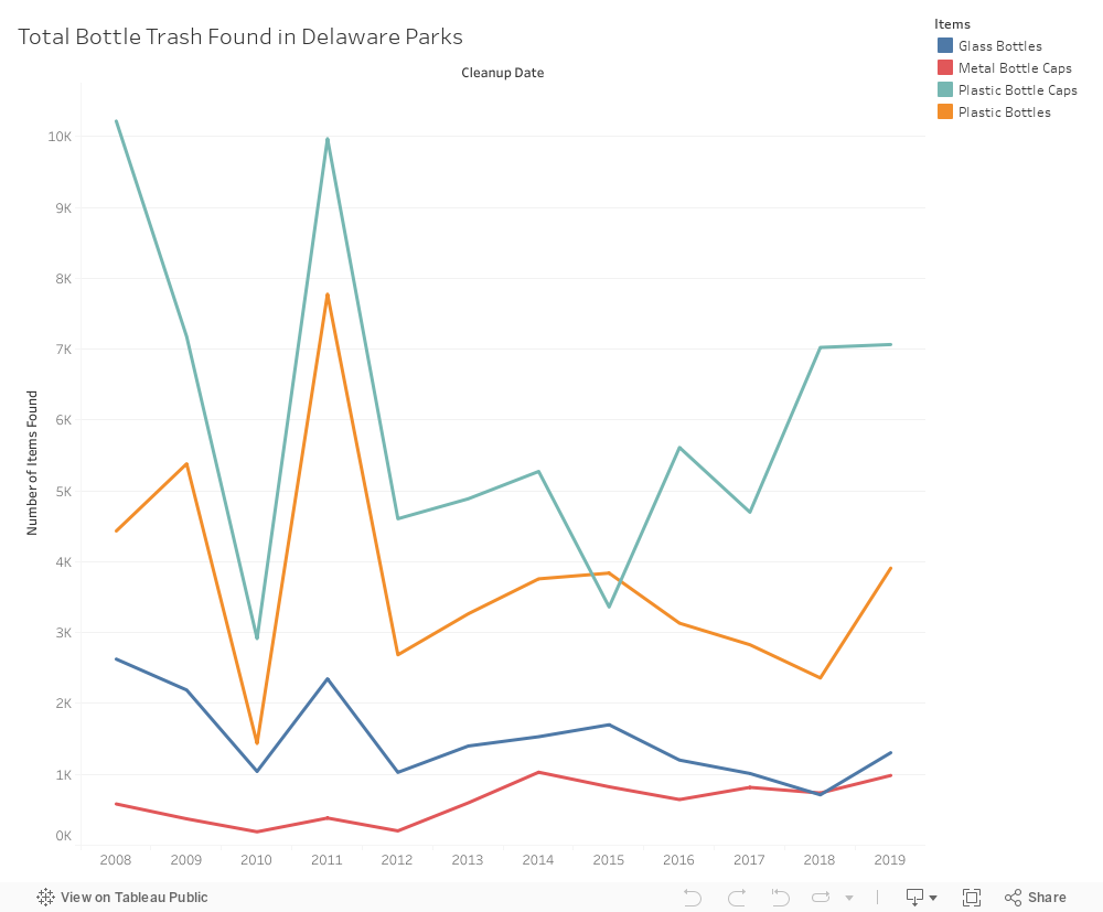
Line Charts
Line charts are an excellent choice for showing changes in data over time. Consider how your data points are connected by the line -- data visualization software will by default draw the shortest line between any two data points, which can create confusion if data is missing.
Things to consider:
- If your data is all over the place (i.e., very high some years and very low other years), consider adding a trend line to show the general change in the data over time. Programs like Excel and Tableau will have this formula built in, but other programs may require you to do the calculation yourself.
- You can add additional lines to show other categories. Use color and labels to distinguish them.
- If data for some time periods is missing, that should be reflected in your chart with a missing segment of the line. Otherwise, the line will connect between the two present data points, which will make it seem as if there is a data point for the missing segment.
- To add greater distinction to your data points, consider creating a stepped line chart.
Visualization created by Kayla Abner using DNREC's Coastal Cleanup Dataset and licensed under CC-BY-NC 2.0.
Scatter Plots
Scatter plots show correlation between variables; each variable is mapped on the x or y axis, and a dot represents where they correlate. See the example below showing the correlation between the duration of Old Faithful eruptions and the time between eruptions.

"Old Faithful Eruptions" is by Maksim is licensed under CC-BY 2.0.
The plot suggests that eruptions that are longer in duration need more "warm-up time" because the time between eruptions is longer. In addition, the data points are clustered between short wait, short duration and long wait, long duration; this suggests there are generally two types.
When making a scatter plot, consider:
- The size of your dots. Each dot represents one data point, so don't make them too large. This type of visualization is useful because it shows clusters of data points to aid understanding of the dataset.
- Understand the difference between causation and correlation. Just because two variables correlate does not indicate cause and effect! See Spurious Correlations for some funny examples of this phenomenon.
- Scatter plots are best for a "medium" sized dataset. If you have too few points, the visual might mislead your viewer by making it appear as if things correlate when they really don't. Similarly. too many data points will be difficult to read.